All Work

TiriVelo

UX Case Study

I built the provider experience around the tasks providers needed to complete with clarity and confidence. By improving navigation, clarifying critical information, and focusing on trust-critical workflows, I made the product feel more usable and dependable.

Cut accessibility problems by about 50%

Reduced extra steps by about 45% and made key information faster to review

Made earnings easier to understand, reducing friction by 30%

UX/UI Design Mobile Provider Experience Marketplace

Unclear fit for how providers actually work.

Research showed that providers needed a platform that fit the way they already work. But early concepts made core tasks like earnings, scheduling, and follow-up harder to understand than they should be.

Problems that stood out

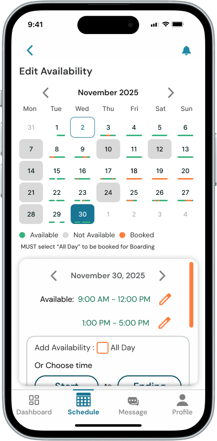
  1. Earnings lacked clarity — payout details were hard to understand

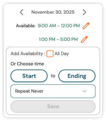
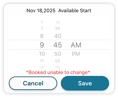
  2. Scheduling felt unclear — next steps were not always obvious

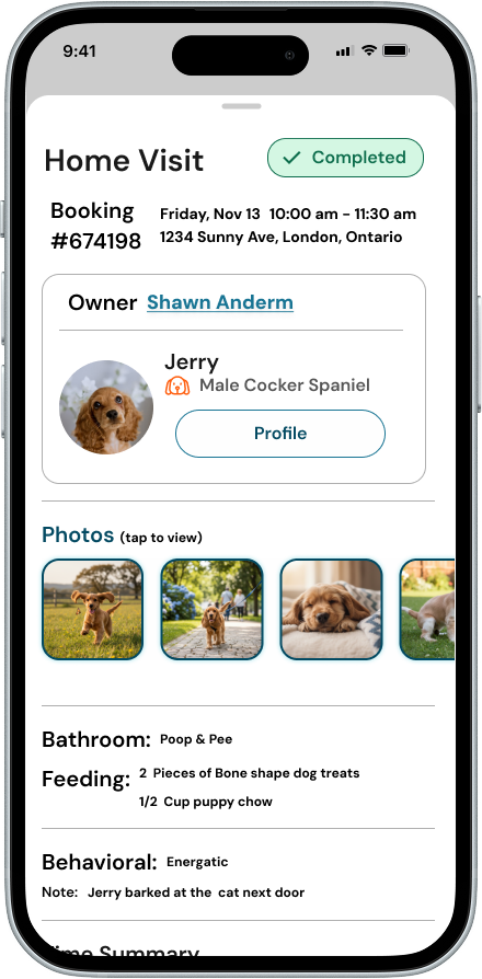
  3. Follow-up felt fragmented — repetitive screens added unnecessary complexity

Context & Constraints

  1. Changing requirements — scope shifted often in a fast-moving startup

  2. Unclear ownership — team responsibilities were not always defined

  3. Limited provider input — direct feedback was hard to get early on

  4. Tight timeline — required focusing only on highest-impact areas


I focused on the parts of the experience that would have the biggest impact on provider trust and usability.

Scope & Risk

Narrowed the work to Earnings and Edit Schedule to keep the project focused and reduce overlap across teams.

Trust Focus

Concentrated on the moments that most affect provider trust: understanding earnings, managing availability, and knowing what happens after a service ends.

Consolidate & Hierarchy

Reduced repetition and clarified information so important details were easier to find and understand.

Validate & Map

Grounded decisions in provider conversations and journey mapping to identify gaps and reduce guesswork.


Improving Scheduling Clarity and Control

I designed scheduling to make availability easier to scan, edits easier to make, and time selection more precise.

Feature 01

Calendar view showing provider availability with clear visual indicators for open and booked days

Availability at a Glance

Providers can quickly see which days and times are open or booked using clear visual cues in the calendar.

Feature 02

Edit panel sliding up within the calendar view so the schedule stays visible during editing

In-Context Editing

Providers can update availability without leaving the calendar. The schedule stays visible while an edit panel slides up, so they can make changes without losing context. Repeat scheduling was previously handled in a separate menu, so I moved it into the edit flow as a dropdown to make updates faster and easier.

Feature 03

Time picker with fine-grained increments similar to the Apple Clock app

Precision Time Control

Providers can adjust time in smaller increments using a familiar picker, similar to the Apple Clock. Previously limited to 30-minute increments, scheduling is now more precise and flexible.

Making Earnings Easier to Understand

I redesigned the earnings view to make payouts easier to review at a glance. Instead of only showing a final total, the screen breaks down service fee, platform fee, tips, and total earnings so providers can quickly understand what they earned and why.

Earnings breakdown showing service fee, platform fee, tips, and total earnings

Earnings Breakdown

  1. Breakdown over total only — shows how the payout is calculated, not just the end result

  2. Visible tips — keeps tips easy to spot within total earnings

  3. Clear payout hierarchy — separates fees and take-home pay for faster understanding

Reducing Redundancy in Post-Service Flows

I simplified the post-service flow by removing duplicate screens, adding missing context, and making follow-up easier to review in one place.

Feature 01

Unified booking summary screen showing booking details, visit info and earnings

Unified Booking Summary

Combined duplicate post-service screens into one clearer summary, so providers could review booking details, visit information, and earnings in one place.

Feature 02

Owner and pet profile details accessible within the post-service flow

Added Owner & Pet Context

Key owner and pet details were missing at important points in the flow, making it harder for providers to confirm service context. I added that information directly into the workflow so they could quickly understand who the service was for and what they needed to do next.

Feedback flow tied to booking with intentional follow-up actions

Feature 03

Clear and Safe Feedback Flow

I found duplicate feedback patterns across the original flow, which made follow-up feel repetitive and disconnected from the booking. I fixed this by creating a reusable feedback component tied to the booking, making the experience clearer, more consistent, and easier to scale.


Providers reported feeling in control for the first time.

Providers felt more confident using the platform. Clearer structure across earnings, scheduling, and follow-up made key tasks easier to review, easier to act on, and easier to trust.

50%

Fewer accessibility issues after improving readability, contrast, and interaction clarity

45%

Fewer extra steps and faster review of key information

30%

Less friction in understanding earnings through a clearer payout breakdown

This project taught me that when a system is still evolving, the hardest part is not designing screens, but figuring out what needs to be clear first. Focusing on trust-critical workflows helped bring structure to the experience and made the product feel more reliable, even as things were still changing.

← Previous case study

ThaiTongue

Structured tone-learning for Thai language learners

View Thai Tongue

Next case study →

FlyKind

Mobile-first e-commerce for upcycled parachute products

View FlyKind